
Figure 1.
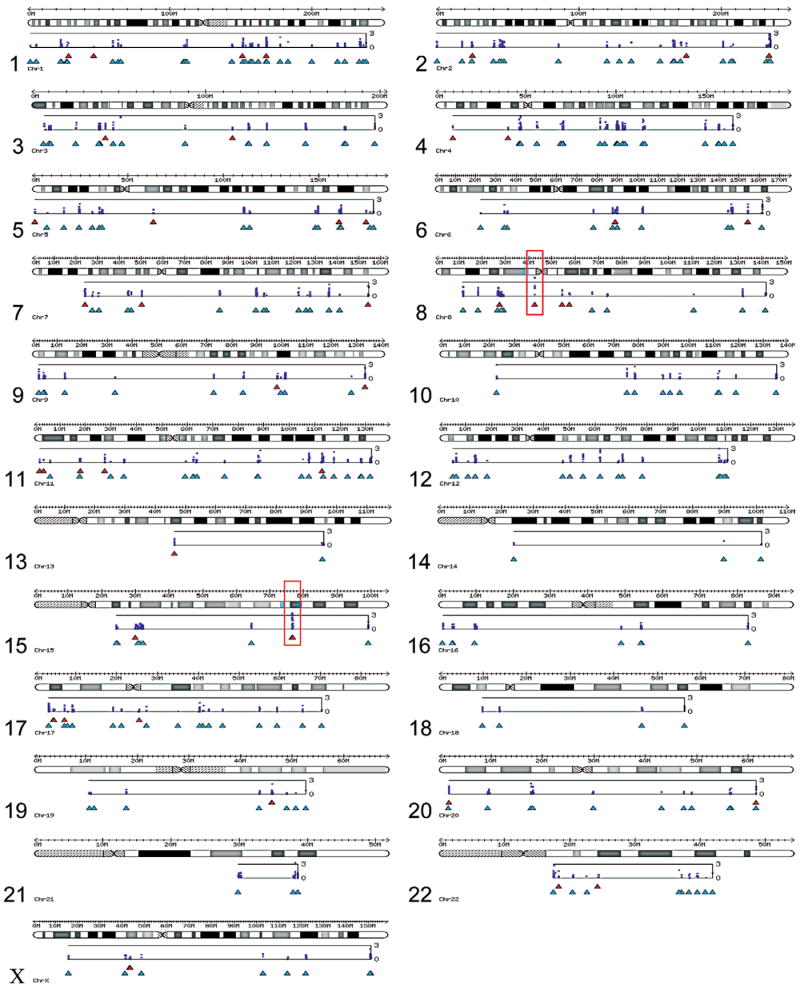
Results of the candidate gene association analysis. The P-values from the primary analysis are plotted for each chromosome below an ideogram using the −log10(P) transformation. The bottom axis is P = 1 and the top axis is P = 10−3. Category A genes are shown below the plots in red and category B genes are shown in cyan below the category A genes. Regions on chromosomes 8 and 15, which are shown in more detail in Figure 2, are highlighted in red.