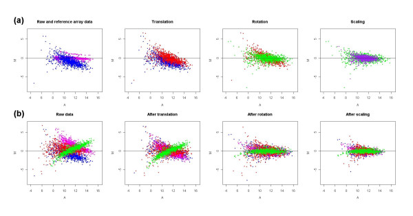
Figure 1.
A geometric transformation of microarray M-A plots in GPA normalization. (a) shows how the M-A plot for one slide transformed during each GPA transformation procedure. The blue points represent raw data; pink points represent reference slide; red, green and purple points represent data points after translation, rotation and scaling, respectively; (b) shows how the M-A plots for four slides represented by four colours (blue, red, pink, green) transformed after each GPA transformation procedure. The SIMAGE method was used to simulate the microarray data set used here, which includes 50 slides with 10% differentially expressed genes and ratio of up-regulated to down-regulated genes is 1:1.

