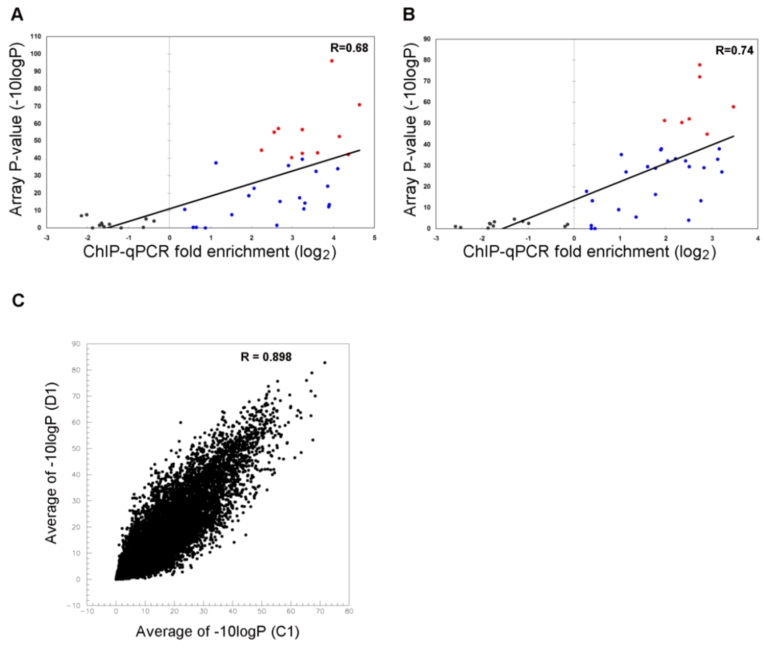
Figure 1. ChIP on chip data Analysis.
(A, B) Relative enrichment measured by ChIP-qPCR for 43 sites in C1 (A) and D1 (B) and the average of −10logP of each of 43 regions were plotted as a scatter plot. Black points represent the un-enriched amplicons, blue points represent the enriched amplicons of qPCR data where −10logP<40 for ChIP on chip, red points represent the enriched amplicons of qPCR data where −10logP≥40 for ChIP on chip. (C) Averages of −10logP at each promoter (±1 kb of TSS) were plotted as a scatter plot. Vertical axis represents D1 liver and the horizontal axis represents C1 liver. Total promoter sites used in this analysis included 16203 sites. Spearman correlation coefficient between C1 and D1 was 0.898.

