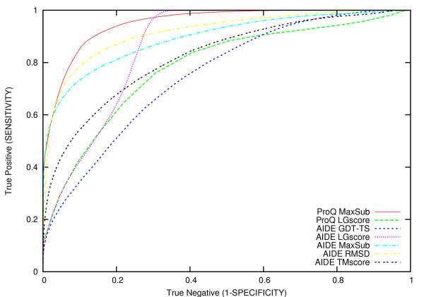
Figure 1.
ROC plots. Comparison of AIDE and ProQ as obtained using a receiver operating characteristic (ROC) plot computed on the complete test-set (lmds, CASP5, hg_structal, MD, Rosetta and 4state-reduced datasets). Each line represents the ROC curve obtained with a specific AIDE or ProQ version. The ProQ MaxSub and the ProQ LG-score are plotted as solid:red and dashed:green line, respectively. The different AIDE versions are plotted as follow: GDT_TS dashed:blue; LG-score dotted:purple; MaxSub dashed-dotted:cyan; RMSD dashed-dotted:yellow; TM-score dashed:black.

