
Figure 3.
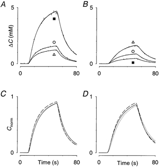
Detailed comparison of diffusion curves shown in Fig. 2
A, three curves taken from hypotonic series in Fig. 2A (indicated by ○ for control, ▵ for recovery and ▪ for value in hypotonic medium). In all three cases original data and curve fitted with eqn (1) are superimposed. To allow detailed comparison, the effect of the different baselines has been removed by plotting ΔC (concentration minus baseline). B, series in hypotonic medium taken from Fig. 2B. Same conventions as in A. The overshoot in the recovery medium is seen here. C, to understand how the differences in amplitude come about this panel uses a normalised plot of fitted curves according to eqn (3) that removes the influence of the changing volume fraction, α, leaving only the effect of tortuosity, λ, and clearance, k’. This panel corresponds to records in A. Control record, dashed line; 150 mosmol kg−1, continuous line; recovery record, dotted line. D, the normalised versions of the records in B. Control record, dashed line; 500 mosmol kg−1, continuous line; recovery record, dotted line. It is clear from C and D that most of the differences in the amplitudes of the curves are removed by the normalisation procedure, showing that amplitude is governed by α. The effects of λ and k’ are to alter the shapes of the curves slightly.