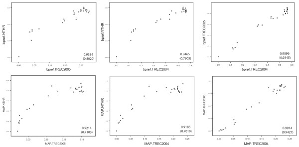
Figure 2.
MAP and bpref performance measures obtained by NT Evaluation and TREC evaluation. The scatter plots compare the performance of methods measured in the NT Evaluation protocol and with TREC relevance judgments (left four plots), or compare agreement between two independent TREC Genomics Track evaluation (rightmost plots). Pearson correlation coefficients are shown in each scatter plot (values in parentheses are Spearman rank correlation coefficients). Better correlations are observed when bpref measures are compared (top row of scatter plots) vs. MAP measures (bottom row).

