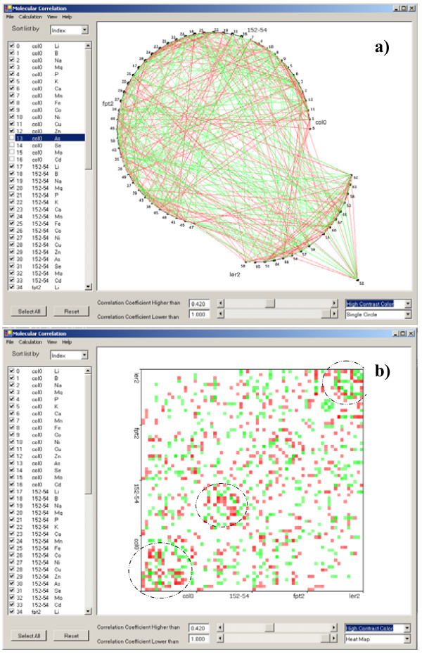
Figure 3.
Graphic display of the same molecular correlations in (a) one circle and (b) heat map with high contrast color schema. High contrast color schema is used to show the correlation directions. Green indicates positive correlation while red indicates negative correlation. The encircled areas in panel (b) readily demonstrate clusters of strong molecular correlation.

