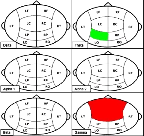
Fig. 3.
The significant differences in relative power between the patient group and the healthy controls within the different frequency bands. Green area: significant higher relative power in the patient group compared to the healthy controls. Red area: significant lower relative power in the patient group compared to the healthy controls

