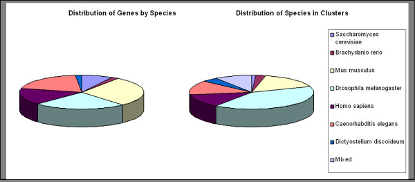
Figure 2.
Cross-species phenotype data distribution. The left pie chart depicts the distribution of genes by species, i.e. the relative number of genes in our gene set according to species affiliation. The right pie chart shows the distribution of clusters according to single species or 'mixed', if the cluster is made up of genes from more than one species.

