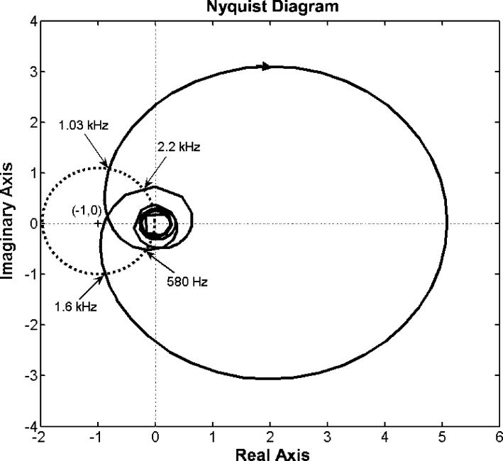
Figure 6.
Nyquist diagram for the open loop response of the hybrid ANC control system. The solid curve represents the response of the control system where each point on the curve represents the system open loop response at a given frequency. An arrow on the curve implies the direction of increasing frequency. The dotted circle is centered at (−1, 0) with unit radius. Four frequency points labeled in the plot are intersects between the solid curve and the dotted circle.

