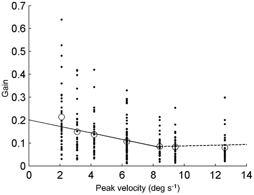
Figure 3. Gains plotted against peak velocity.

Each individual COR-gain is represented by a dot. Mean gains are represented by the circles. The dotted straight line is fitted through the individual data points having a stimulus peak velocity higher than 7 deg s−1. The continuous line is fitted through the other individual data points.
