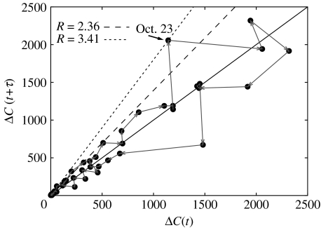
Figure 2.
The course of the outbreak can be visualized in an epidemic time-delay diagram of new cases ΔC at consecutive times (black dots). For data that are not too stochastic, this provides a very simple method to estimate R, via the tangent at the origin (dashed lines) of the initial growth trajectory (grey arrows). Jumps in case numbers (indicated for 22–23 Oct) lead to greater uncertainty in the estimation of the reproduction number.

