
FIGURE 2.
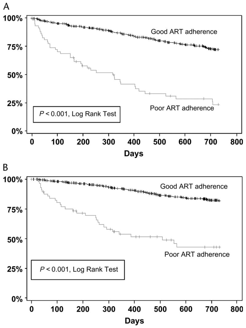
Survival curves for time to treatment failure (A) and virologic failure (B). The vertical axis is the percentage of patients not yet having met the endpoint, and the horizontal axis is time in days. Patients whose adherence was classified as “poor” were significantly more likely to fail than those whose adherence was classified as “good.”