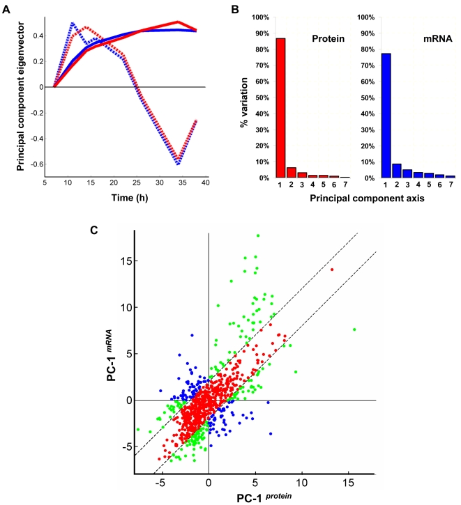
Figure 4. Principal component analysis of transcriptome and proteome data.
(A) ‘Loadings’ (eigenvector) plot for the first two principal component axes – PC-1 (solid lines) and PC-2 (dashed lines) from proteome (red lines) and transcriptome (blue lines) data (B) Percentage of variation accounted for by each of the seven principal components in proteome and transcriptome data (C) Values of genes along PC-1protein plotted against PC-1mRNA. Green and blue dots represent genes with significantly large difference in expression trends (|PC-1protein−PC-1mRNA|≥2). Of these, blue dots indicate those which are likely to exhibit opposing trends (2nd and 4th quadrants). All other genes are shown as red dots.

