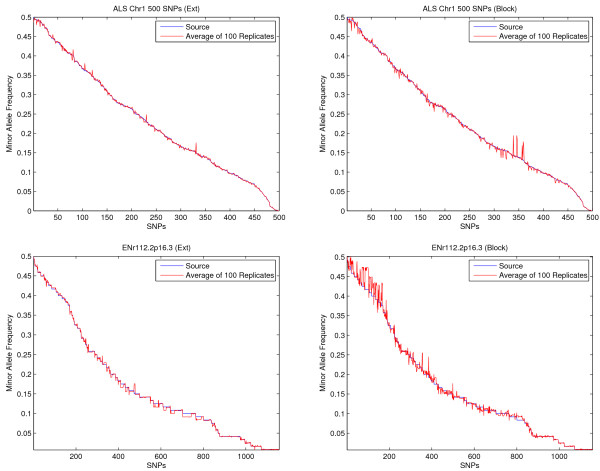
Figure 3.
Allele frequencies from simulated data. Comparison of the average allele frequencies from 100 replicates (red) and the allele frequencies from the original input data (blue) based on the extension method (left) and the block method (right) using the ALS data (top) and HapMap region ENr112 (bottom). For each panel, the SNPs in the original data are aligned on the x axis in the decreasing order of their minor allele frequencies. The y axis is the measure of allele frequencies.

