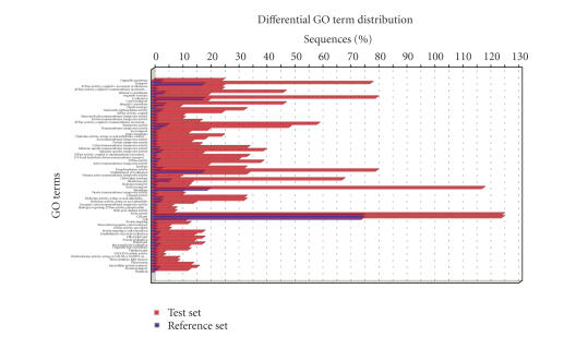
Figure 11.
Bar chart for functional category enrichment analysis of Soybean membrane proteins. The Y-axis shows significantly enriched GO terms and the X-axis give the relative frequency of the term. Red bars correspond to test set (membrane) and blue bars correspond to the whole Soybean genome array.

