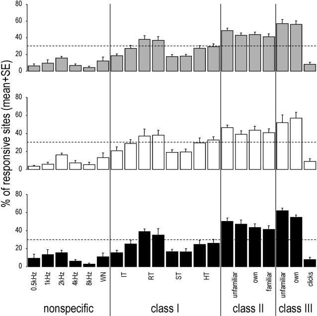
Figure 3. Mean (+SE) percentage of responsive sites that responded to each stimulus.
Grey bars: pooled data of both hemispheres; white bars: data of the left hemisphere; black bars: data of the right hemisphere. As the familiar and bird's own class-II songs changed from one bird to another, the data obtained for the two bird's own whistles and for the two familiar whistles were combined. The dashed lines correspond to the uniform expected distributions calculated using the standard method of predicting that the same proportion of sites (weighed by the mean number of stimuli to which they responded) will respond to each stimulus.

