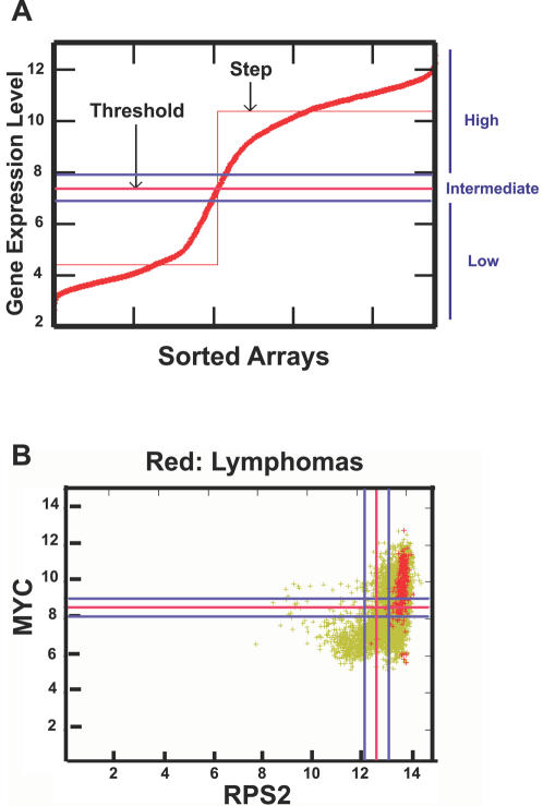
Figure 10. Overview of Boolean analysis of gene expression in all human microarray data with U133A format.
(A) The gene expression from all the U133A arrays was first normalized and ordered from low to high. Each red mark represents one array data (total of 7,171 arrays). The StepMiner algorithm was then applied to define a threshold (the red line) and an “intermediate” region was set with a value of 0.5 around this threshold (blue lines). The expression above or below the “intermediate” region is considered as “high” or “low”, respectively. (B) A scatter plot of MYC expression (Y axis) versus RPS2 (X axis) is shown here. Each green mark represents one array data (total of 7,171 arrays). Red spots represent lymphomas (total of 273 arrays). The red lines represent the thresholds and the blue lines mark the “intermediate” region. Other examples of Boolean analysis are shown here (Figure S7).

