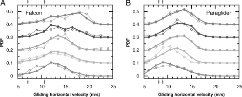
Fig. 3.
Comparison of the actual and the predicted (by the MacCready theory) speeds. This figure shows two distributions of the gliding horizontal velocities during the top 5 days concerning thermalling conditions for the falcon (A) and two paragliders (B) who are among the few best performing contestants. The data are shifted upward by a value 0.1 for different days to improve the visualization. The filled and open symbols denote the circling radius distribution (PDF) of the predicted and the actual values, respectively. The predicted values were obtained by feeding the climbing rate distribution into the MacCready formula and calculating the corresponding horizontal velocity distribution from it. A perfect agreement between the observed velocities and the predicted ones would correspond to birds and people applying the theory to a 100% degree. The left and the right arrows on the x axis show the horizontal velocity value corresponding to the minimum sink and the best glide ratio, respectively.

