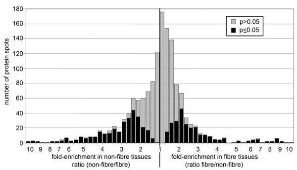
Figure 3.

Frequency distribution of mean intensity ratios for all spots. A mean ratio near 1 meant the spot was found in equal abundance in both tissues; spots represented to the right of this point on the axis had higher signal intensity in fibre tissues, while spots represented to the left were more intense in non-fibre tissues. The grey and black regions of each bar show the portion of spots for which p > 0.05 and p ≤ 0.05, respectively, in a t-test of the significance of differences in intensity between fibre and non-fibre tissues.
