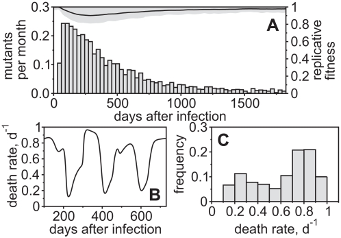
Figure 4. Distribution of Immune Escape over the Course of Infection.
(A) Viral escapes over time given as an expected number of escapes per month (average of 1000 simulations). It can be seen that most escapes occur during the first year after infection (acute phase) and fewer afterwords (chronic phase). The straight line shows the replicative fitness of the viral population as an average over all simulation runs (standard deviation is given by the gray area). The time of escape is measured when an escape variant breaches a frequency of 50% of the total viral population for the first time. (B) Time-plot of average infected-cell death rates during the chronic phase of infection. The graph shows one simulation representing a single patient. (C) Histogram of the death rates that are bound between 0.1 d−1 and 1.0 d−1. For (B) and (C),  . For all figures, hk = 1012, i.e. killing follows mass-action dynamics.

