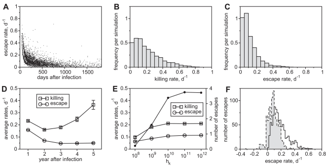
Figure 5. Rates of Killing and Escape.
(A) The emergence of escape and the corresponding rates over a time course of 5 years of infection. (B) Given those escapes, the distribution of killing rates given as an average frequency per simulation run. (C) The distribution of escape rates given as an average frequency per simulation run. (D) Average killing and escape rates per year after infection. (E) The number of escapes during 5 years of infection (filled circles) and the average rate of killing and escape as a function of hk (open symbols). (F) Estimated rates of escape by artificial virus sampling. The two histograms show the distribution of the estimated (gray bars) and the true escape rates (black line). Mean of the estimated rates is 0.09±0.08 d−1 and the mean of the true rates is 0.19±0.11 d−1. All graphs represent data from 1000 simulation runs. The rates are measured when the frequency of the escape variant is 50%. Means are given with standard errors since standard deviations are usually very large. hk = 1012 if not otherwise indicated.

