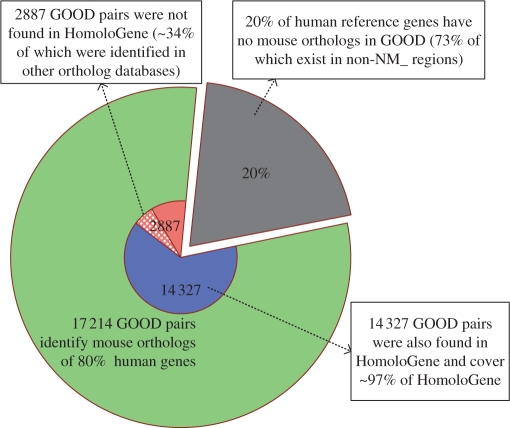
Figure 3.
Pie chart representation of GOOD ortholog data. The whole pie reflects the total number of human reference genes (21 544 human regions) from the RefSeq (NCBI build 36). The green shading represents the percentage of human reference genes that the program was capable of considering for GOOD. The grey shading represents the percentage of human reference genes that are not represented in GOOD [73% of these reference genes are located in non-NM_regions (regions not supported by experimental evidence), where ortholog designation is difficult]. The blue shading represents those ortholog pairs identified by both GOOD and HomoloGene. GOOD identified 97% of the ortholog pairs in the HomoloGene database. The orange shading represents those ortholog pairs identified by GOOD that were not represented in HomoloGene; 34% of these ortholog pairs (light orange) were represented in one of the other three existing ortholog databases.

