
Figure 3.
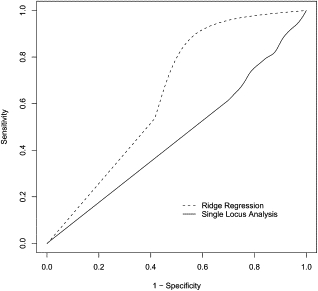
ROC Curves Comparing the Performance of the Single-Locus Analysis and the Ridge-Regression Methods
Each ROC curve represents the performance of one of the two regression methods when trying to detect association between the 26 SNPs of the CHI3L2 region and a simulated phenotype (solid line = single-locus regression; dashed line = ridge regression). Results are averaged among varying number (1–25) of functional loci.