
Figure 5.
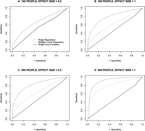
ROC-Curve-Based Overall Comparison of Analysis Methods
Each ROC curve represents the performance of one of the three regression methods when trying to detect association between a set of 20 loci and a phenotype (solid line = single-locus regression; dotted line = standard multiple regression; dashed line = ridge regression). Results are averaged among varying number (1–19) of functional loci. Dashed line indicates ridge regression, dotted line indicates multiple linear regression, and solid line indicates single-locus analysis.