
Figure 6.
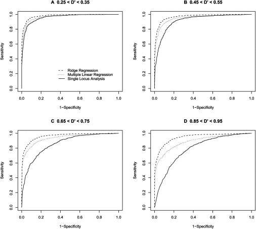
ROC-Curve-Based Comparison of Analysis Methods Based on an Allele Frequency of 0.25
ROC curves comparing the performance of three regression-based methods for association analysis when the frequency of the “1” allele is 0.25. Each ROC curve represents the performance of one of the three regression methods when trying to detect association between a 2 loci (one functional and one nonfunctional) and a phenotype (solid line = single-locus regression; dotted line = standard multiple regression; dashed line = ridge regression). The sample size was fixed to 100 people, and the functional loci had an effect of size 0.5. Dashed line indicates ridge regression, dotted line indicates multiple linear regression, and solid line indicates single-locus analysis.