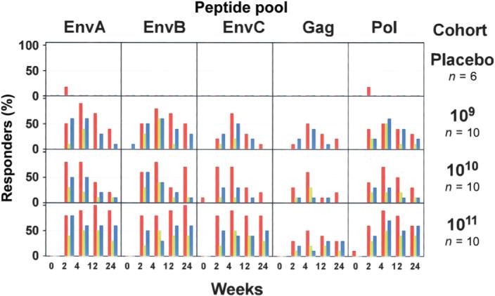
Figure 3.

Frequency of subjects with detectable T cell responses. T cell responses to each peptide pool in all dose groups are shown. Each box shows the entire time course for each T cell assay. The Y-axis of each box shows the frequency of positive responders to the respective peptide pool for each assay as percentage of subjects in a dose group (0%−100%). Red bars indicate CD4+ T cell responses as measured by intracellular cytokine staining (ICS) assay, green bars indicate CD8+ T cell responses as measured by ICS assay, and blue bars indicate CD4+ or CD8+ T cell responses as measured by enzyme-linked immunospot assay (ELISpot).
