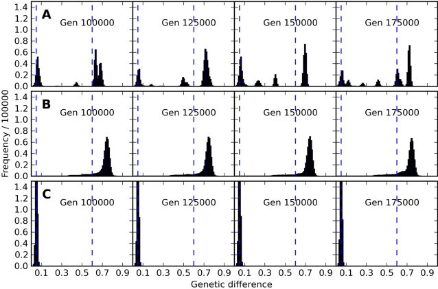
Figure 4. Time Series of Pair Similarity Histograms.
Snapshots of frequency histograms of the genetic difference of randomly selected pairs of individuals from three runs, setting (A) low movement distance δ = 1.5 with outbreeding depression θ = 0.6, (B) low movement distance δ = 1.5 with no outbreeding depression, and (C) larger movement distance δ = 5 with θ = 0.6. Plots are shown horizontally for a sequence of four generations (100,000, 125,000, 150,000, and 175,000) within each of the conditions A, B, and C. The number of peaks does not correspond directly to the number of distinct genetic types in the population (see text for discussion of this important point). Video animations in MPEG format of the time course of the pair similarity histograms are available online in Video S1, Video S2, and Video S3. These animations are far more revealing of the fascinating time dynamics of these simulations than the small sequence of frames shown above.

