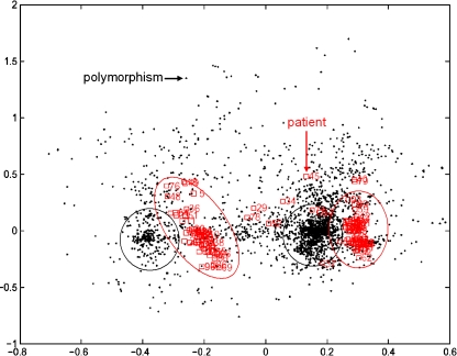
Fig. 5.
Biplot representation of the results from a correspondence analysis of the PR data. The different polymorphisms are shown as black dots. Each red square represents a patient sample. The majority of samples fall into two clusters which are highly associated with particular groups of mutations

