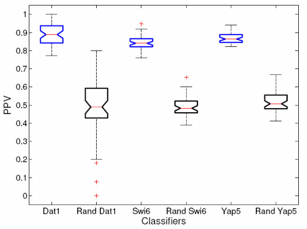
Figure 8.
Actual vs. Shuffled Classifiers Box-plots. Because 50 classifiers represent each TF, cross-validation of each classifier produces a population of PPV measurements for each TF. These populations may be used to compare the significance of the actual vs. the label-shuffled classifiers (denoted with the prefix "Rand"). Here the comparison is shown for Dat1, Swi6, and Yap5 using box-and-whisker plots. The red line in each box represents a median value, and the top and bottom lines of the box represent upper and lower quartile values. If the notches on adjacent boxes do not overlap, then the population medians are considered different at 95% confidence. The whisker length is default for Matlab and is a maximum length of "1.5 times the interquartile range" [74]. The plus (+) signs represent possible outliers existing beyond this range. In each instance the real-data classifiers perform significantly better than the label-shuffled classifiers.

