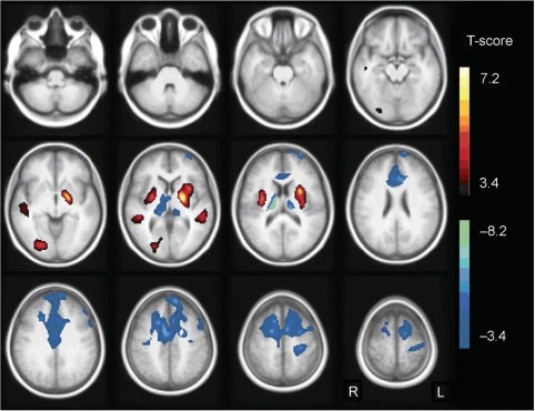
Fig. 6.
SPM T-map of the analysis of patients versus controls. Relative hypermetabolism in the patient group compared with controls is indicated in yellow/red, hypometabolism in blue/green. Results are projected on an average spatially normalized in-house T1 image of healthy controls. R = right; L = left.

