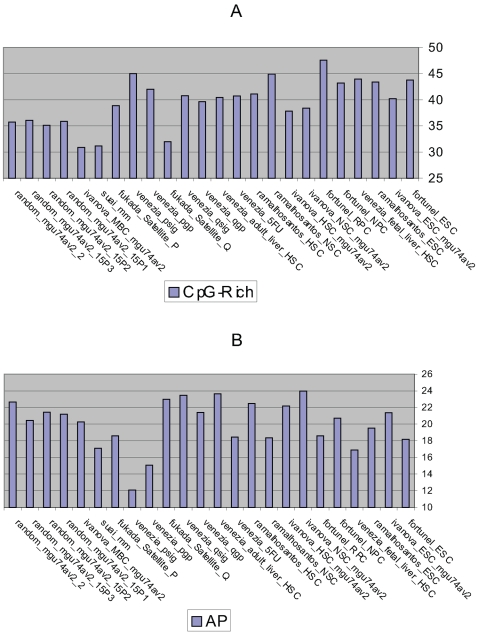
Figure 4. The percentages of the genes classed according to the promoter type.
The promoters are characterised using the Bioinformatics methods outlined in part 3 (Fig 1). The y-axis reports the percentage of genes using (A) CpG-rich promoters and (B) APs whilst the x-axis reports the data sets analysed (Tables 1, 2).

