
Figure 4.
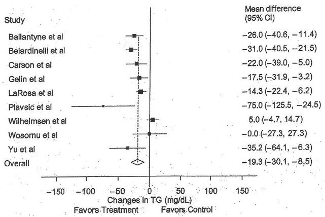
Forest plot for changes in triglycerides (TG). The black boxes represent the mean change in TG for each study, and the lines represent the 95% confidence intervals. The diamond and dashed lines represent the overall mean change in TG across all listed studies, whereas the left and right ends of the diamond represent the 95% confidence interval for all studies combined.