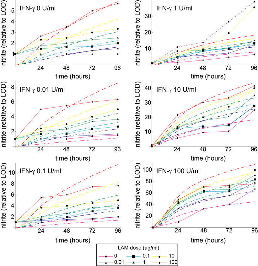
Figure A1.
Simulations and experimental data shown as time series over 96 hours. The mathematical model reproduces experimental trends over the entire 96 hour time frame. Dashed lines represent simulated nitrite output for various LAM doses, while solid lines with data squares represent experimental data. The two dotted lines represent dose levels excluded from the fitting (see Footnote 1 in the main text).

