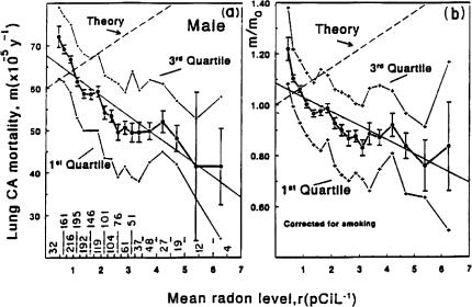
FIGURE 1.
Lung cancer mortality rates before (Fig. 1a) and after (Fig. 1b) correction for smoking prevalence vs average radon levels in homes, for 1601 U.S. counties. Data points shown are the average of ordinates for all counties within the range of r-values shown on the base-line of Fig. 1a; the number of counties within that range is also shown there. Error bars are one standard deviation of the mean, and the first and third quartiles of the distributions are also shown. Theory lines are arbitrarily normalized lines increasing at a rate of +7.3% per pCi/L as predicted (after the smoking correction) by LNT. These figures are used only for presentation; all analyses, including the straight line fit to the data shown here, use the 1601 actual data points.

