
FIG. 5.
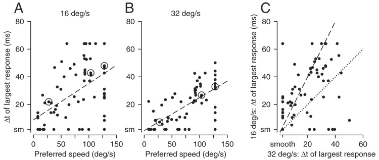
Quantitative analysis of the full sample of MST neurons. In each graph, an individual symbol summarizes the responses of a single MST neuron. A and B: relationship between the value of Δt that caused the largest opponent response and preferred speed, where A and B show data for apparent motion at 16 and 32°/s, respectively. Values for preferred speed and best Δt were taken as the values on the x-axis at the peaks of the spline fits to the data. Dashed lines in A and B indicate the best linear fit to the data, obtained by Type II regression with the assumption of equal variances along the x- and y-axes. Circled data points show points for the example neurons shown in Fig. 2. C: relationship between the value of Δt that caused the largest opponent response for apparent motion at 16 vs. 32°/s. Dotted and dashed lines have slopes of 1.0 and 2.0. Note that 6 neurons appear as a single point at the bottom left corner of the graph because the value of Δt along both axes was 2 ms. Ticks on the axes labeled “smooth” (or “sm”) refer to apparent motion when Δt was 2 ms, effectively smooth motion.