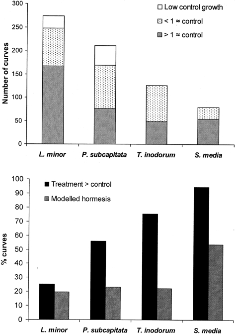
FIGURE 2.
In the top panel the bars represent the total number of dose-response curves for each of the species represented in the data-base study. The proportion of the curves that were either not included due to low control values, or due to an incomplete dose range in the low dose region are shown in white without and with spots. The grey part of the bars gives the number of curves that passed the entry criteria and were used in the study. The bottom panel shows the proportion of the curves that passed the entry criteria which had treatments above 105% of the control average (black bars), and the proportion which was better described with a model including hormesis (grey bars).

