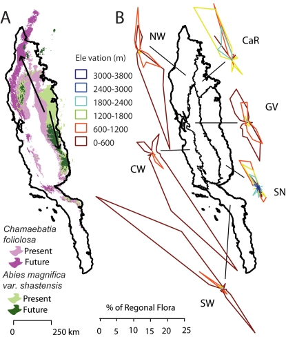
Figure 3. Movement of species geographic centroids based on HadCM3 simulations using the A1FI emission scenario 80 years in the future and assuming species can move.
(A) Two representative species that have adjacent present ranges (lighter colors) and are projected to move in opposing directions (arrows and darker colors). (B) Projected centroid movements for all species. Individual polar plots group species by the floristic region in which their centroid originates. Within each plot, species are grouped by the elevation in which their centroids originate. The magnitude of the directions represents the percentage of the regional flora moving in each direction.

