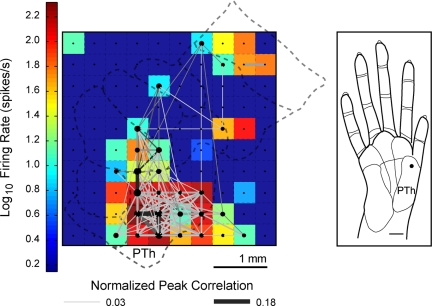
Fig. 2.
An example of widespread spike timing correlations and firing activity. Significant peak correlations across the sampled neuron-units in the 100-electrode array are displayed in a grid. A color map representing the peak firing rates of the units is overlaid on a schematic of the area 3b hand representation to indicate the approximate spatial locations of the electrodes. Shown is one example from monkey 1 when a single site on the thenar (PTh) palm was stimulated repeatedly (100 trials). Dots indicate electrode sites and significant correlations between units are represented by the lines connecting the dots. The size of the dots and the thickness of the connecting lines are visual representations of the peak magnitude of the correlation. Each colored box represents the peak firing rate of a unit at one electrode site. Peak firing rates are shown for those units included in the synchrony analysis. Dark blue squares indicate electrodes not analyzed for spike synchrony because units did not show sustained responses to stimulation.

