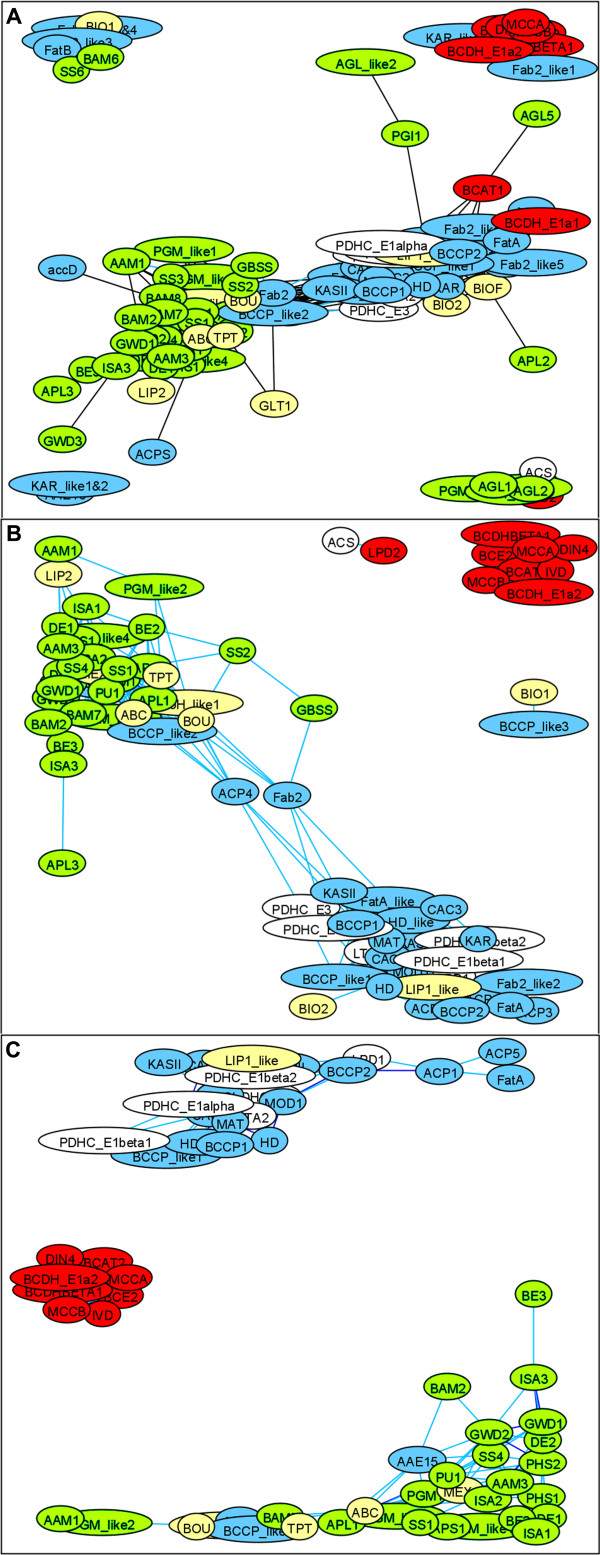
Figure 2.
Coexpression of genes within three core metabolic pathways. The entities with correlations above the threshold are connected with an edge; networks at three thresholds of Pearson correlation are compared: A, 0.5; B, 0.6; and C, 0.7. With increasing correlation threshold, the within-pathway links emerge from noisy inter-pathway connections. Node colors represent the metabolic function assigned to each gene (blue: fatty acid synthesis, green: starch metabolism, red: leucine catabolism, yellow: transport or cofactor synthesis, white: acetyl-CoA generation) [see Additional file 1 for gene names]. The networks layouts were produced by GraphExplore software. The most densely crowded nodes indicate genes with the highest co-expression. Within each of these three co-expression networks the number of links between genes from the same metabolic pathway is significantly larger than in randomly generated networks with similar link structure. Isolated nodes not shown.

