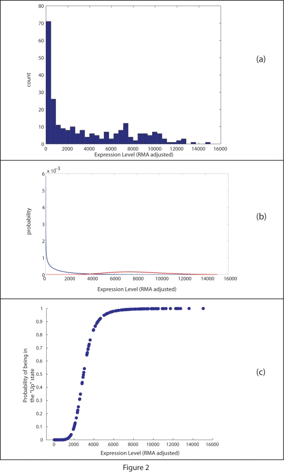
Figure 2. An in-depth look into data from a single probe over a collection of 251 hybridizations of breast cancer samples.
(a) Displays a histogram of gene expression data for a single probe across the collection of 251 samples. The x-axis corresponds with levels of expression and the y-axis is a count of expression level for the specific bin. As the panel shows, many of the hybridizations show a level of expression close to zero. This is visible through a large collection (large count) of gene expression measurements close to zero expression levels. On the other hand, many of the probes show expression levels that spread across the entire span of expression levels from zero to 16,000. This is well-fitted into a gamma mixture model that assumed a dual behavior for the gene. Panel (b) shows a plot of the approximated distribution functions across the entire gene expression range for the surveyed probe. The two lines plotted have been calculated by fitting gene expression into the assumption of a binary state distribution, with each distribution modeled by a Gamma-like behavior. Panel (c) gives the probability of being in an “up” state as a function of gene expression for the specific probe surveyed. As panels (b) and (c) overlap, we demonstrate how changes in expression levels in (c) associate that level with the curves of panel (b). The higher an expression level in (c) is, the more probable it is to be affiliated with the red curve (“up” curve) of panel (b). The lower the expression level is in (c), it is more probable to affiliate it with the blue curve (“down” curve) of panel (b), and with a “down” state. Being in a “down” state is the reciprocal of being in an “up” state, which gives a probability of zero for being “up”.

