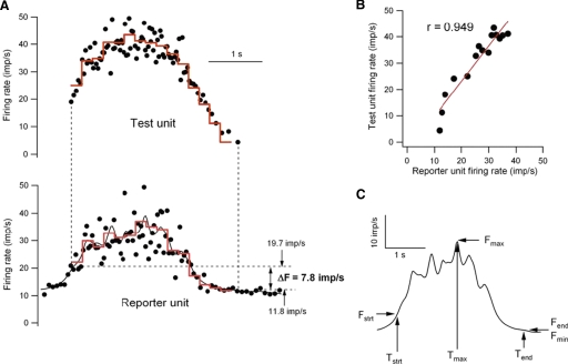
FIG. 2.
Analysis of paired discharge records. A: instantaneous discharge rates (black dots) of the test unit (top) and reporter unit (bottom). The solid black line in the bottom trace is the smoothed firing rate of the reporter unit. The red lines represent the firing rates of the 2 units averaged over the same 0.2-s time bins. B: relation between the average rates of the test and reporter units (red lines in A). C: characterization of time course and amplitude of the modulation of smoothed firing rate in the reporter unit. See text for further details.

