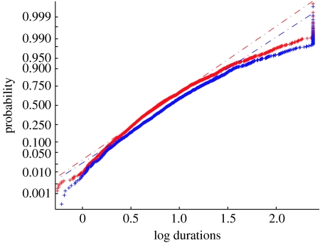
Figure 5.
The CDF for all percept durations plotted on a log scale. Patient log percept durations (blue plus symbols) and control log percept durations (red plus symbols) were pooled separately after normalization. Both datasets roughly follow a straight line, indicating that after transformation, the data are approximately normally distributed. The curve for the control participants rises faster indicating that the control group has shorter percept durations than the patient group. The best-fitting line for the control data (red dashed line) could not adequately describe the patient data (blue dashed line; Χ22=57, p<0.001).

