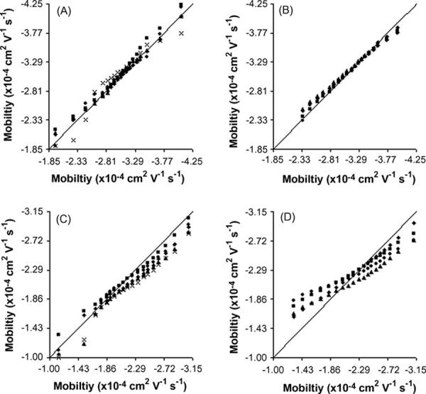
Figure 1.

Quantile-Quantile plots of mitochondrial populations. Every 0.05 quantile from 0.05 to 0.95 (left to right) for each sample population (y-axis data) is plotted versus the quantiles of the population with the largest number of events (x-axis data). The solid line is a reference that represents a perfect match between the two data sets. A) mouse liver on uncoated capillaries, B) mouse liver on AAP capillaries, C) rat Liver on AAP capillaries, and D) rat liver with PVA coated capillaries. Legends for the symbols are presented in supporting information (Table S-1).
