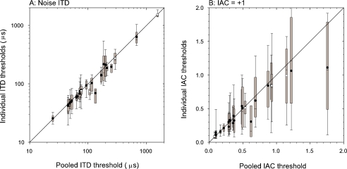
Fig. 10.
Comparison of pooled discrimination thresholds with thresholds derived from individual tokens. Box plots are used to represent the distribution of token thresholds. The gray box shows the interquartile range (25% to 75% percentiles), the whiskers show the 10% and 90% percentiles. The circles show the mean of the individual token thresholds. Open: peak units; filled: trough units. (A) Noise ITD discrimination thresholds away from best reference. (B) IAC discrimination thresholds away from a reference of +1.

