SUMMARY
Daily disease monitoring via a public health surveillance system provides valuable information on population risks. Efficient statistical tools for early detection of rapid changes in the disease incidence are a must for modern surveillance. The need for statistical tools for early detection of outbreaks that are not based on historical information is apparent. A system is discussed for monitoring cases of infections with a view to early detection of outbreaks and to forecasting the extent of detected outbreaks. We propose a set of adaptive algorithms for early outbreak detection that does not rely on extensive historical recording. We also include knowledge of infection disease epidemiology into forecasts. To demonstrate this system we use data from the largest water-borne outbreak of cryptosporidiosis, which occurred in Milwaukee in 1993. Historical data are smoothed using a loess-type smoother. Upon receipt of a new datum, the smoothing is updated and estimates are made of the first two derivatives of the smooth curve, and these are used for near-term forecasting. Recent data and the near-term forecasts are used to compute a color-coded warning index, which quantify the level of concern. The algorithms for computing the warning index have been designed to balance Type I errors (false prediction of an epidemic) and Type II errors (failure to correctly predict an epidemic). If the warning index signals a sufficiently high probability of an epidemic, then a forecast of the possible size of the outbreak is made. This longer term forecast is made by fitting a ‘signature’ curve to the available data. The effectiveness of the forecast depends upon the extent to which the signature curve captures the shape of outbreaks of the infection under consideration.
Keywords: monitoring, forecasting, outbreak detection, Cryptosporidium
1. INTRODUCTION
The goal of disease monitoring via surveillance systems is to protect public health. The ability of an infection such as Cryptosporidium to cause waterborne outbreaks has led many countries to require laboratories and physicians to report all confirmed cases of this disease to local or state health departments. Cryptosporidium is a reportable pathogen that is resistant to drinking water disinfection (Meinhardt et al., 1996; LeChevallier et al., 1991), and may cause an outbreak when extreme weather events challenge water supplies (Rose et al., 2001; Curriero et al., 2001; Patz et al., 1996). Surveillance systems provide valuable information on population risks. Analysis of the surveillance data in a timely fashion is essential for well-targeted health prevention strategies. Efficient statistical tools for early detection of rapid changes in the disease incidence are a must for modern surveillance.
Aberrations are typically defined as changes in the current disease distributions as compared to historical or baseline information and may include spikes and step-shifts. To identify aberrations in systematically collected public health infectious disease surveillance data, several computerized analytical methods, including the historical limits method, compound smoothing technique, log-linear regression, quality control, and cyclical regression, have been suggested (Hutwagner et al., 2000). All of the currently used techniques require five years of baseline data and different outlier reweighing schemes. Little research has been done on sensitivity and specificity of these methods, especially with respect to an enteric infection vulnerable to environmental changes. Furthermore, a detected aberration may or may not indicate an outbreak.
The purpose of this article is to introduce a system for monitoring cases of infections with a view to early detection of outbreaks and forecasting the extent of detected outbreaks. We proposed a set of adaptive algorithms for early outbreak detection that does not rely on extensive historical recording, but considers epidemiology of infection disease for efficient forecasting. Data considered as an illustration and a motivating example are borrowed from a series of studies of the well-documented outbreak of cryptosporidiosis, the largest water-borne outbreak in U.S. history caused by malfunction-ing of the water treatment plant (Morris et al., 1998; Naumova et al., 1999). We use a one-year time series of daily counts of emergency room visits for non-specific gastroenteritis (further referred to as GI dataset or ADULT93) among adults residing in Milwaukee, WI, in 1993, recorded by the main emergency facility in the city.
The paper is organized as follows. In Section 2 we provide initial assumptions for modeling and discuss the projection of the mean value function, which is performed by estimating the first two derivatives of the smoothed function at the time of the last observation and by evaluating a truncated version of the Taylor series expansion of the function for a segment of time sufficiently far in advance of the last observation. In Section 3 we introduce an index of severity and flagging. The index of severity is defined in terms of the estimate of the mean value function and its projection, evaluated in a time period around the time of the most recent observation. The interpretation of the index for a particular day depends not only on the size of the index for that day, but also on its context. Flagging reflects levels of concern about an outbreak classified into five categories, each of which is associated with the color of a hoisted flag. In Section 4 the notion of forecasting in endemic and epidemic modes is introduced. In the ‘attenuated forecast’ the forecasts are blended together with high weight given to the loess smooth projection in the early part of the forecast and high weight to the mean in the later part of the forecast segment. The ‘signature’ forecast incorporates specific information regarding typical progression of an outbreak for a given infection. Section 5 addresses issues associated with the price that must be paid to improve the power (specificity) of the suggested methodology. In the conclusion we discuss future studies needed.
2. PROJECTING THE MEAN VALUE FUNCTION
It is assumed that daily counts of cases are recorded and that the time series is generated by a random process which produces an equi-spaced series of random non-negative integers. It is assumed that the random process has mean and variance/covariance functions that may vary in time, i.e. the process may be non-stationary. In particular, it is expected that there may be outbreaks of the infection during which more than the ‘usual number’ of cases are reported. We assume that the ‘usual number’ of cases is the background or endemic level of the disease incidence. Thus, a possible model for the mean value function is
| (1) |
where f(t) is a function representing the mean of the endemic counts of cases at time t, S(·) is a function characterizing the shape of an outbreak and will be referred to as the base signature function for disease outbreaks, Si(·) is S(·) amplified to accord with the extent of the ith outbreak, t1i is the date of the onset of the ith outbreak, t2i is the date of termination or resolution of the ith outbreak, and δ(t1i,t2i) is a function that assumes the value 1 during the period of the ith outbreak and otherwise is zero. Examples of the background, or endemic, function, f(t), are
| (2) |
for the case of constant background infection rates and
| (3) |
for the case of seasonal fluctuations in the background infection rates.
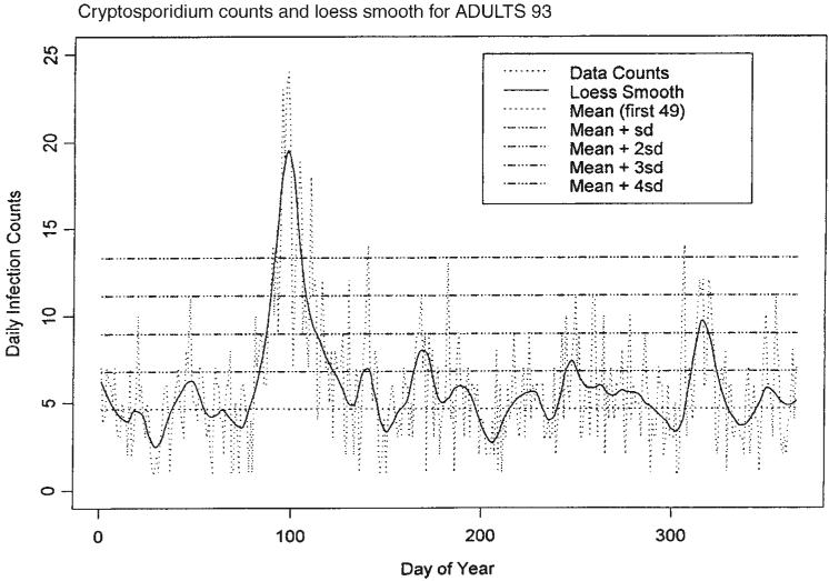
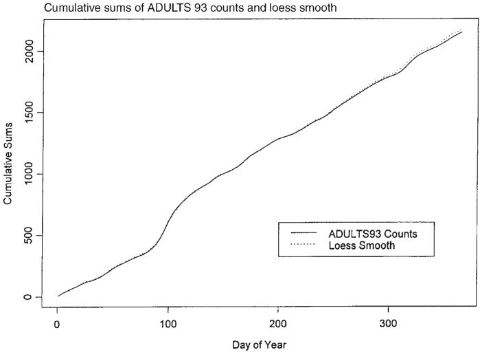
A possible model for the random process generating the time series of daily counts for a particular infection is a time-dependent Poisson process with intensity function μ(t) defined in (1). First, we estimate the mean value function using a loess-type smoother to the time series of daily counts. The span of the smoother must be long enough that random fluctuations in the background infection rates are not chased, yet short enough to react to the onset of an outbreak. A time series of daily counts of GI cases is shown in Figure 1. Superimposed on the plot of the counts is a loess smooth of the data; the span ratio of this non-parametric smoother is equal to 25/365. The data indicate an outbreak associated with the cryptosporidiosis infection during the period with starting and ending days of about 75 and 130, respectively. An indication of the effectiveness of the smoothing in grasping the essentials of the daily counts is shown in Figure 2, which contains a plot of the cumulative sums of the data and of the smoothed function.
Figure 1.
Time series of daily counts of emergency room visits for non-specific gastroenteritis (GI) with the superimposed ‘loess’ smoothed curve; a set of horizontal lines indicates the location of the mean and four sigma levels
Figure 2.
Time series of cumulative sums of GI counts and the smoothed function
The estimate of the mean value function (1) by a loess-type smoother will vary according to the amount of data used. If the entire set of data is available, then the smoothing can be made using all the data. However, if one is working in real time then the data are available no further than the current time. A loess-type smoother fitted to the data up to the current time will not necessarily coincide with the smoothed fit that takes into account the whole set of data. The smoothed fit to the truncated data set will in most incidences be a better fit to the data immediately prior to the present than will the fit that must take into account all the data, but it will be unable to anticipate the future path of the mean value function as effectively as the fit that uses all the data. However, when working in real time the fit to the truncated data set is all that is available and it is used for projection purposes.
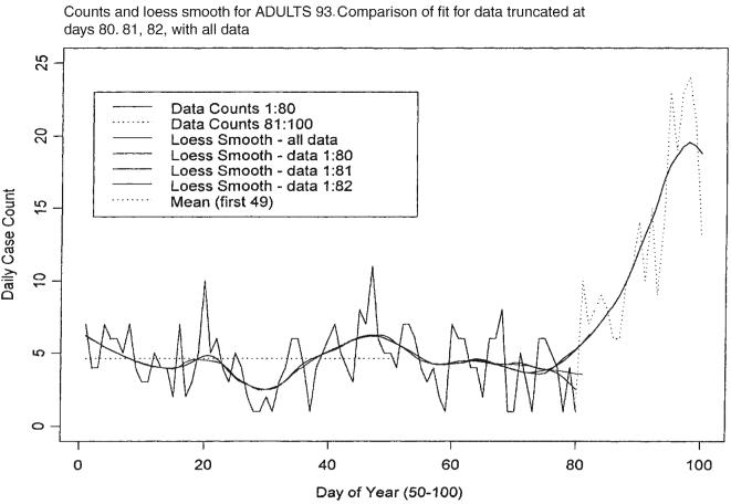
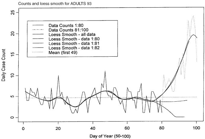
Projection of this function is accomplished by estimating the first two derivatives of the smoothed function at the time of the last observation, and then evaluating a truncated version of the Taylor series expansion of the function for a segment of time sufficiently far in advance of the last observation. In the example considered below the time segment has been chosen to be 14 days forward including the time of the last observation. The first and second derivatives are estimated using first and second differences of the daily values of the smoothed function. Figures 3 and 4 illustrate these points using the actual data compared with the fit for data truncated at days 80, 81 and 82. When we smoothed a segment of length n, the span ratio was chosen to be 25/n, n > 25, thus making the smooth of each segment correspond closely to the smooth of other segments and of the whole data set except for end points. The projections shown in Figure 4 for each of the sets of data ending at days 80, 81 and 82 indicate very different expectations for the future path of the mean of the infection counts.
Figure 3.
Time series of daily GI counts and loess smooth for the first 100 days compared with the fit for data truncated at days 80, 81 and 82
Figure 4.
Time series of daily GI counts and loess smooth for the first 100 days compared with the projection for data truncated at days 80, 81, and 82
3. INDEX OF SEVERITY AND FLAGGING
A problem with model (1) is that the starting times t1i and ending times t2i for the outbreaks are not specified in advance. Hence, a monitoring system must be in place to detect, in a timely fashion, the start time and to predict the end time for outbreaks. To begin, it is assumed that the model in (2) applies to the data under consideration, i.e. the background infection rates are constant. A section of the count data that does not include any part of an outbreak is selected as a training set for use in estimating the background infection rate. In the case of the presented data in Figure 1, the first seven weeks of daily counts, X, yield a sample mean X̄T = 4.633 and a sample standard deviation sT = 2.164; these values are consistent with a Poisson hypothesis for the distribution of the first seven weeks of counts. To assess whether an observation is likely to have been drawn from a population with a mean equal to 4.633 and standard deviation of 2.164, a set of four sigma levels is calculated. These are 1, 2, 3 and 4 standard deviations above the mean. Observations in excess of one or more of these levels raise concern that an outbreak may have begun, and the higher the level the greater the concern. Also, large values of an estimate of the mean value function are further cause for concern that an outbreak has begun. Figure 1 illustrates the sigma levels overlaid on the disease counts and the loess smooth of the data.
The index of severity described below is mainly defined in terms of the estimate of the mean value function and its projection, evaluated in a time period around the time of the most recent observation. High values of the index signal a high level of concern for an outbreak. The method of calculation of the index first focuses on the ‘day’ under consideration and computes a value that is determined by how atypical are the data for the given ‘day’, for the days before, and for the forecasts thereafter. Four characteristics contribute to the index of severity: the maximum value of the estimate of the mean value function during the week prior to the ‘day’ under consideration, z1; the counts of cases for the ‘day’ under consideration, z2; the estimate of the mean value function at the ‘day’ of observation, z3; and the maximum of the forecasts for the next thirteen days, z4. Values from 0 to 4 are assigned to these characteristics depending upon how many standard deviations a characteristic is above X̄T. Table 1 indicates what the contribution to the index is according to the size of the observation. Thus, it can be seen that the minimum value that can be assigned to the index for the ‘day’ of observation is zero and the maximum is 16, with any other integer value between 0 and 16 being possible.
Table 1.
Contribution to index by size of observation
| Size of observation X | Contribution to index |
|---|---|
| X < X̄T + ST | 0 |
| X̄T + ST ≤ X < X̄T + 2ST | 1 |
| X̄T + 2ST ≤ X < X̄T + 3ST | 2 |
| X̄T + 3ST ≤ X < X̄T + 4ST | 3 |
| X̄T + 4ST ≤ X | 4 |
The interpretation of the index for a particular day depends not only on the size of the index for that day, but also on its context. If previous days have had small index values, then a large value for the ‘day’ under consideration must be judged in terms of the probability of making a Type I error. On the other hand, if the index values for the previous days have been large, then it will be more important to judge the value of the index in terms of making a Type II error. Hence, we computed an adjustment to add to the index that takes into account the sizes of the previous six values of the index. If the previous values have been low, the adjustment will be small, and if they have been high then the adjustment will be large. The augmentation for each of the previous six days is computed according to Table 2. It can be seen that the total augmentation for a particular day may be as low as 0 and as high as 24.
Table 2.
Augmentation of the index by size of severity index values
| Size of trailing index I | Contribution to augmentation |
|---|---|
| I<5 | 0 |
| 5≤I<9 | 1 |
| 9≤I<13 | 2 |
| 13≤I<15 | 3 |
| I=16 | 4 |
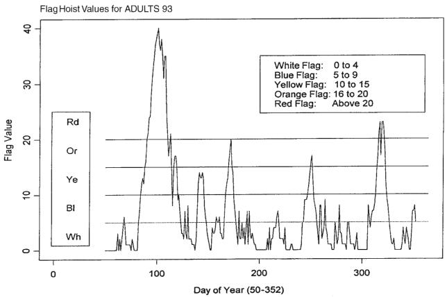
Levels of concern about an outbreak are classified into five categories, each of which is associated with the color of a flag. Hoisting a red flag signals the highest level of concern, whereas hoisting a green flag signals the lowest level of concern. Intermediate levels of concern are associated with blue, yellow and orange arranged in increasing levels of concern. Because interpretation of the size of the augmented index is in terms of flag hoists, it will be referred to below as the ‘flag index’. The sequence of days for which the flag index was computed includes the first day after the 7-week training period and the last day of the yearly set for which forecasts are computed, i.e. from day 50 to day 352 = 365 − 13. Figure 5 presents the flag hoist values and the flag color ranges for a time series of daily GI counts. The graph demonstrates that a major outbreak occurred during the period for days from 75 to 130, and a minor outbreak is signalled for the period from day 300 to day 320.
Figure 5.
Flag hoist values and the flag color ranges for a time series of daily GI counts. The first seven weeks were used for training; incomplete forecasts for last 13 days
4. FORECASTING
The model defined by (1) implies that the mean value function is in one of two modes at any given time; one is the endemic mode, while the other is the outbreak (epidemic) mode. This means that two alternating forecasting modalities must be at the ready. When the endemic mode is in effect, the object of a forecasting exercise is the function f(·). When the outbreak (epidemic) mode is in effect, the object of a forecasting exercise is f(·) + Si(·). In both cases the loess-smooth of the count data prior to and including the current day furnishes the platform for forecasting. Each of the two forecasting methodologies is discussed in the sequel.
4.1. Attenuated forecasting
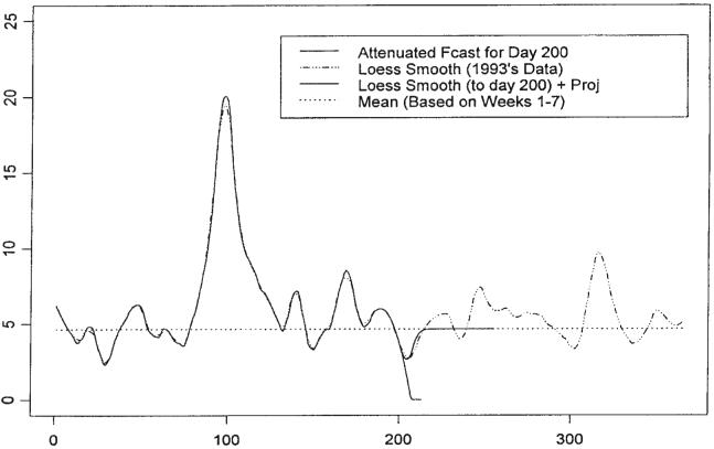
Forecasting when model (1) is in its endemic mode is considered first. If one assumes the model for f(·) is (2), i.e. a constant, then an estimate for f(·) is X̄T. In our case, X̄T = 4.633. However, the loess smooth also provides an estimate of f(·) and the Taylor series projection of the loess smooth furnishes a short term forecast of f(·); in the case of forecasting the GI data, the length of the term including the last day of observation is 14 days. Since the loess smooth and its projection endeavor to capture any trend in the mean value function, it is assumed that in the short term the loess smooth/projection will be superior to X̄T in approximating the loess smooth calculated using the entire data set, but in the longer term, X̄T will be superior. To take advantage of each estimation method, the forecasts are blended together, with high weight given to the loess smooth projection in the early part of the forecast and high weight to X̄T in the later part of the forecast segment. The blended forecast is referred to as the ‘attenuated forecast’.
Figure 6 illustrates the attenuated forecasts from day 200 of GI daily counts. Note that, in the case of attenuated forecasting, all forecasts are for 8-week segments. The loess smooth up to day 200 followed by its Taylor series projection is plotted together with the mean for the training data and the attenuated forecast. The loess smooth based on the entire data set, which is an estimate of the mean value function, is presented to allow comparison of the forecasting procedures.
Figure 6.
Illustration of the attenuated forecasts from day 200 of GI daily counts of ADULTS93. All forecasts are for 8-week segments
4.2. ‘Signature’-forecasting
Should the flag index signal the beginning of an outbreak then questions may be asked regarding the outbreak's extent. How many cases may be expected during the outbreak? How long is the outbreak likely to last? In general, these questions are difficult to answer. However, for specific infections, prior information may be available regarding the progression of the outbreak. In the discussion that follows it is assumed that the ‘shape’ of the outbreak, or an epidemic curve, is known. In other words, it is assumed that the shape of the signature function of (1) is known. It is further assumed that the flag index and the proximate count data will provide information useful for estimating the magnitude and duration of the outbreak. It should be noted that it is the mean value function that is to be forecast beyond the time of the most recent observation, and that the mean value function will have been estimated up to and including the most recent observation using a loess-type smoother.
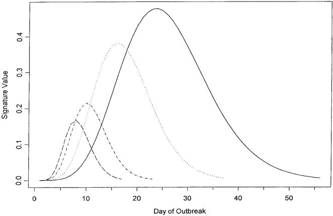
The daily counts of an infection outbreak are often characterized by a steep increase early in the outbreak followed by a plateau and an attenuated decline. A family of functions that could be used to model such a shape is the gamma family. Figure 7 contains several curves all of the shape of a Gamma (12, 4) shorn of left and right tails. The range of the selected curve is estimated using the flag trail of recent data, and the amplitude is chosen by fitting the curve to recent projections of the estimates of the mean value function. Of course, other families of functions may be more appropriate for modeling an outbreak of an infection pursuing a course with a non-gamma shape, but in such a case it is expected that the flag trail and the recent projections of the estimates of the mean value function will still be useful in estimating the extent of the outbreak.
Figure 7.
Gamma (12, 4) ‘signature’ bases
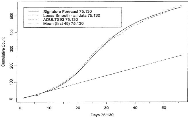
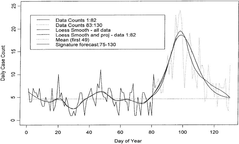
We now provide an example, which exhibits the potential and pitfalls of signature forecasting. The data considered are those of Figure 1 up to day 82. Figure 4 contains the loess fit of the data up to day 82 and the Taylor series projection up to day 95. This projection fits very well to the loess fit constructed using all the data. Of course this loess fit will not be available for real time analysis. Figure 8 demonstrates a signature fit to our data from day 75 to day 130. It also contains the loess smooth fit up to day 130 constructed using the entire set of data; the fit of the signature curve does not use any data past day 82 but it does use the projection. The shape of the base signature curve is that featured in Figure 7. A simple exercise is used to fit the signature curve to the projection. The mean value computed using the training data X̄T = 4.633 is subtracted from each element of the loess fit up to day 82 and the 13 days of projection. Then the 8-week base signature curve is amplified to make a segment of it fit with the corresponding segment of the 82nd day's mean corrected projection. In this case the segment of the signature curve is simply the 18th day's value, which is made to coincide with the 93rd day's value of the projection; note that the signature curve starts at day 75 and that 75+18=93. Since the loess curve is estimated up to day 82 and forecast thereafter, the beginning segment of the amplified base signature curve is blended with the mean-corrected loess curve to make a smooth join. Then the training mean X̄T is added to the blended signature curve to produce the gamma-type curve of Figure 9. Note that a method for deciding the amplitude of the signature curve has been provided but the range was chosen arbitrarily; this issue is discussed below.
Figure 8.
Cusums: Signature forecasts, loess, ADULTS93 and mean with the estimate of the extent of the outbreak for days 75–130
Figure 9.
Signature forecasts from day 82 to day 130 for the first 130 days of the year for ADULTS93
The data used to produce Figure 9 may be used to produce cusums for days 75 through 130. These are graphed in Figure 8. The coincidence of the graphs for the actual data, for the loess fit to all the data, and for the signature forecast is good. The last terms in the cusums can be used to obtain an estimate of the number of cases due to the outbreak free of the background count. In this case the extent of the outbreak is estimated to be 297 cases.
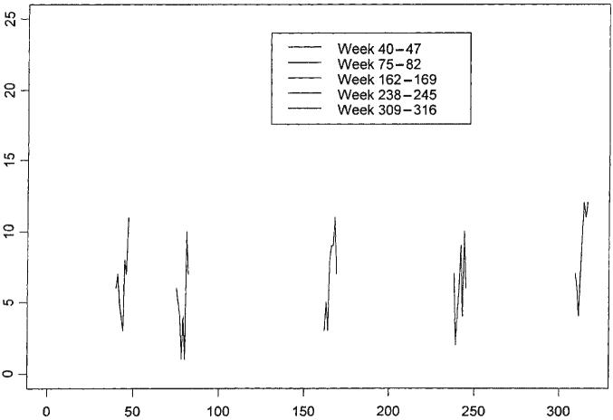
This example illustrates the potential of signature forecasting, but it does not address the issue of pitfalls associated with Type II errors (lack of specificity). Figure 10 presents 5 separate weeks of data selected from the raw data set, while Figure 11 presents the same data overlaid on the entire data set. The data were selected to appear similar to that of the second of the weeks, which is the week that launched the outbreak of cryptosporidiosis from day 75 to day 130. However, if one were to apply the same signature forecasting procedure to each of the other four weeks' data, one would have committed a Type II error in each case. The price that must be paid to improve the power (specificity) of the methodology is discussed in the next section.
Figure 10.
Sample weeks of data selected from GI dataset, ADULTS93
Figure 11.
Sample weeks of data highlighted from GI dataset, ADULTS93
5. SIGNATURE FORECASTING USING THE FLAG HOIST INDEX
The flag hoist index sends a signal regarding the likelihood of an outbreak of an infection. If the index is low (green flag), there is little evidence suggesting that an outbreak is imminent. If it is high (red flag), there is overwhelming evidence that an outbreak has begun, or is about to begin. Intermediate values of the index suggest that the outbreak forecasting machinery should be in a state of preparedness. Thus, if the flag hoist index is below a predetermined threshold during a segment of time, then attenuated forecasting is applied to the data, but if the index is at or above the threshold, attenuated forecasting should be replaced by signature forecasting. For the raw data, the predeter- mined threshold is set at 10, i.e. a possible outbreak is associated with a non-green/blue flag hoist. In other words, the epidemic mode is associated with a flag index value of 10 or greater, while the endemic mode is associated with a flag index value less than 10.
In the event that signature forecasting is initiated, the size of the flag index is used to estimate the length of a possible epidemic; values just above the threshold are associated with minor outbreaks and larger values are associated with outbreaks of larger size and length. An ad hoc formula relating flag index values to length of epidemic in the event of a non-green/blue flag hoist is given in (4). Let ρ denote the number of days in the range of the signature curve, τ represent the threshold for signature forecasting, and n denote the value of the flag hoist index. Then
| (4) |
For the GI dataset, τ 10.
The signature base curves in Figure 7 are created from the Gamma (12, 4) function as follows. First, the function g(t), where
is evaluated on a 0.01 grid from 0 to 10 producing 1001 equispaced values of g(·). This set is reduced in size by including only those from the 50th to the 600th, thus pruning off the left and right tails and creating a set of 551 equispaced values. A frequency factor is created by rounding k to the nearest integer rdi(k), where k is
and where ρ is obtained from (4). Then every rdi(k)th value starting from the 50th to the 600th of the unpruned set of values of g(·) is selected to form the base signature curve. In the event ρ=56, then rdi(k) = 10, and every 10th value is selected, making a total of 56; these are plotted as one of the curves in Figure 7.
The maximum range achieved using the method above is 56 and the minimum is 17. These limits are chosen to reflect the realities of our data. Different infections or dferent local circumstances may require ranges with different maxima and minima. As can be noted from Figure 9, the observed data end at day 82 but the fit of the signature curve with a maximum range of 56 begins at day 75, a week prior to the last day of observation. This allows the signature curve a period of time to achieve a value commensurate with the fact that the outbreak is likely to have been detected sometime after it has actually started. In the event the range is the minimum, then the left tail is much shorter than when the range is a maximum. Hence, in the case of a range smaller than the maximum, an addition to the left tail is required to allow for the possible delay in detection of an outbreak. The values added to the tail are selected from the left tail that was shorn from the gamma function to produce the signature function; these values are of negligible size. The number of days added to the left tail for various ranges can be found in Table 3.
Table 3.
Augmentation to the signature range by size of range (less than 56)
| Size of trailing index I | Augmentation |
|---|---|
| 17≤ρ<24 | 5 |
| 24≤ρ<32 | 4 |
| 32≤ρ<40 | 3 |
| 40≤ρ<48 | 2 |
| 48≤ρ<56 | 1 |
For example, if the flag index is 10 then the range estimate as computed from (4) is 17. Table 3 calls for an augmentation of 5 days to the range for a total of 22 days. All forecasts are computed for a total of 56 days, so this requires a further augmentation to the right tail. This is accomplished by computing the number of days required (in this case it is 56 − 22 = 34) and selecting that number of values from the right tail shorn from the gamma function earlier (these again are negligible in size) and appending them to the signature curve.
Consider forecasting for day 166. Since the flag index for this day is 10, the example above indicates that the estimate of the range of the signature function is 17 and the augmentations on the left and right sides are of length 5 and 34, respectively. The signature fit is blended with the loess fit and its projection for day 166. This fit is plotted in Figure 12 along with the training mean, the loess fit and projection for data up to day 166 and the loess smooth for all data (up to day 220). The example plotted in Figure 12 happens to coincide with a case where the threshold has been equalled or exceeded. The forecast made from day 166 does not imply a large outbreak, and data from succeeding days provide confirmation. The system reacted with a subdued response, and this can be regarded as the correct response.
Figure 12.
Signature forecasts for day 166 of GI dataset ADULTS93 based on a flag index of 10
The next example concerns the data for days 75 to 130. A preliminary analysis of these data appears in Figure 8. The analysis worked fine for these data, but the discussion that followed showed that general application of it would result in such lack of specificity (low power) as to be discredited. The rest of this section is devoted to a discussion of the price that must be paid to reduce the probability of Type II errors and yet keep the probability of Type I errors small. The flag index values for days 82 to 101 appear in Table 4. These values determine the range for the base signature function according to (4); these values also appear in Table 4.
Table 4.
Signature fit data for days 82–101
| Day | Index | Range | Augmentation | Fitted segment | Inflator | Total cases |
|---|---|---|---|---|---|---|
| 82 | 7 | NA | NA | NA | NA | NA |
| 83 | 10 | 17 | 5 | 8–11 | 12.71 | 297 |
| 84 | 12 | 21 | 5 | 9–12 | 18.35 | 328 |
| 85 | 13 | 23 | 5 | 10–13 | 16.48 | 325 |
| 86 | 12 | 21 | 5 | 9–12 | 11.56 | 301 |
| 87 | 15 | 27 | 4 | 11–14 | 8.14 | 297 |
| 88 | 16 | 29 | 4 | 12–12 | 11.04 | 317 |
| 89 | 20 | 37 | 3 | 1–12 | 15.29 | 361 |
| 90 | 21 | 39 | 3 | 15–12 | 21.22 | 410 |
| 91 | 24 | 45 | 2 | 16–12 | 19.64 | 424 |
| 92 | 24 | 45 | 2 | 16–12 | 23.27 | 453 |
| 93 | 28 | 53 | 1 | 17–12 | 20.56 | 468 |
| 94 | 31 | 56 | 0 | 18–21 | 21.27 | 472 |
| 95 | 33 | 56 | 0 | 18–21 | 23.46 | 478 |
| 96 | 35 | 56 | 0 | 18–21 | 24.99 | 509 |
| 97 | 37 | 56 | 0 | 18–21 | 30.51 | 563 |
| 98 | 38 | 56 | 0 | 18–21 | 30.44 | 562 |
| 99 | 39 | 56 | 0 | 18–21 | 28.87 | 547 |
| 100 | 40 | 56 | 0 | 18–21 | 28.54 | 543 |
| 101 | 37 | 56 | 0 | 18–21 | 27.84 | 536 |
The sizes of the augmentations to the left tail as defined in Table 4 also appear in the table. The 5th column of Table 4 contains the end points of the segment of the augmented signature curve used to fit the signature function to the corresponding segment of the projection of the loess smooth. The upper end of the segment is computed as follows. Let Xm denote the abscissa of the maximum ordinate of the augmented signature curve and let usg denote the upper end of the segment and lsg denote the lower end of the segment. Then Xm, lsg and usg are related as follows:
where, if x is a real number, rni(x)is x rounded off to the nearest integer. Table 4 contains a column of inflators for each day from 83 to 101. The segment is defined so as to be a part of the ascending slope of the base signature curve but also so as to avoid being part of the plateau at the top of the curve. Each of the four elements of the chosen segment of the base signature curve is divided into the corresponding element of the loess projection less the training mean. The inflator is obtained by averaging the four ratios. The base signature curve is then inflated through multiplication by the inflator. The training mean is then added to each element of the inflated base signature curve to obtain the fitted signature curve.
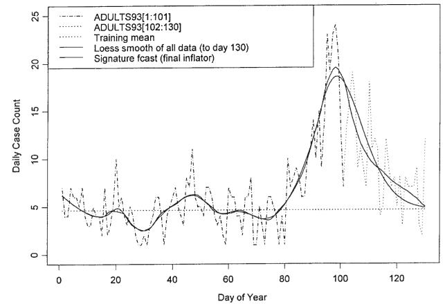
Figure 13 presents plots of each of the fitted signature curves. As dictated by the ranges in column 3 and the inflators of column 6 of Table 4, the signature curves corresponding to the early days of the outbreak represent subdued responses to the low and middle values of the flag index. As the outbreak matures, the signature curves attain their full range. The inflators computed as the outbreak approaches its peak, i.e. days 97 to 101, are relatively stable. These values are averaged to provide a final inflator for the signature forecast, namely 29.24. This forecast is presented in Figure 14. The last column presents the sums of the case counts as forecast by each signature curve. These can be compared with the sum of the case counts for GI for the days 75 to 130, namely 556. The case count for the mean value 4.633 over this period is 259.
Figure 13.
Signature fits for days 83–101
Figure 14.
Signature fit/forecast for days 75–130 using data up to day 101 and ‘final’ inflator
The analysis in an earlier section of the GI data ending at day 82 provided forecasts equivalent to the best of the forecasts of this section, which used data up to day 101. However, as indicated by the top row of Table 4, the data for day 82 does not even qualify for a signature curve forecasting exercise since its flag index is less than the threshold for a switch from endemic to epidemic mode. Recall also that the forecasts for day 82 did not involve an estimate of the size of the range. Thus, the cost of power improvement and estimation of the range involves a significant delay in making a definitive forecast of the extent of the outbreak. However, the delay in signalling an outbreak were considerably less, i.e. an orange flag was hoisted on day 88 and a red flag was hoisted on day 89.
6. CONCLUSION
The presented approach for monitoring and forecasts provides a new look on the use of bio-surveillance data for early detection of outbreaks. The system proposed here is partly based on ideas borrowed from control charting in quality assurance. The incorporation of epidemiological information on the properties of the epidemic process into forecasts enhances the system. We are able to obtain reasonably good forecasts for well-documented data from the 1993 Milwaukee cryptosporidiosis epidemic, the largest recorded waterborne disease outbreak in the history of the U.S. In this study we use retrospectively collected data, but assume that a reporting mechanism is available on a next-day-after-it-happens basis. There will probably always be some delays in reporting. Methods to deal with this problem need to be built into the system. This specific outbreak occurred after a rapid snowmelt and a filtration system failure in the overloaded local water treatment plant (MacKenzie et al., 1994). It is very plausible that integration of additional information obtained from other components of the surveillance (e.g. drug sales, water quality parameters, meteorological information) into the forecasting algorithms would provide better results. The Milwaukee outbreak occurred in the spring, an unusual time for cryptosporidiosis that typically exhibits a seasonal increase in late summer—early fall (Naumova et al., 2000). A study that considers seasonal fluctuations in the endemic infection process is required. In building signature base curves we consider epidemiological observations for an incubation period; the lag between the timing of exposure and response that is for cryptosporidiosis is known to be around 7–8 days. However, an incubation period may vary among sensitive subpopulations; furthermore, for other pathogens the mean incubation period may be longer, e.g. Giardia—14 days, or shorter, e.g. Shigella—5 days. Therefore, an investigation of the signature base curves for infections with various epidemic properties is required.
Many theoretical and computational issues regarding monitoring and forecasting waterborne infections remain to be investigated. Among them are the following:
Simulation studies should be conducted to fine-tune the parameters for monitoring and forecasting methods discussed above and to obtain estimates of the probabilities of Type I and Type II errors under various circumstances.
Confidence interval estimates are required for forecasts.
Smoothers additional to loess should be investigated to see which would provide the best projections.
A suite of SPLUS functions is available to carry out most of the data analysis called for by the methods discussed above. However, good documentation is required to make the functions easily accessible.
ACKNOWLEDGEMENT
We wish to thank the National Institute of Allergy and Infectious Diseases, who provided funding through the AI43415-grant to Drs. Naumova and MacNeill.
REFERENCES
- Curriero FC, Patz JA, Rose JB, Lele S. The association between extreme precipitation and waterborne disease outbreaks in the United States, 1948–1994. American Journal of Public Health. 2001;91(8):1194–1199. doi: 10.2105/ajph.91.8.1194. [DOI] [PMC free article] [PubMed] [Google Scholar]
- Hutwagner L, Thompson W, Groseclose S, Williamson GD. An evaluation of alternative methods for detecting aberrations in public health surveillance data; Proceedings of Joint Statistical Meetings, Section: Biometrics; 2000. pp. 82–85. [Google Scholar]
- LeChevallier MW, Norton WD, Lee RG. Giardia and Cryptosporidium spp. in filtered drinking water supplies. Applied & Environmental Microbiology. 1991;57(9):2617–2621. doi: 10.1128/aem.57.9.2617-2621.1991. [DOI] [PMC free article] [PubMed] [Google Scholar]
- MacKenzie WR, Hoxie NJ, Proctor ME, Gradus MS, Blair KA, Peterson DE, Kazmierczak JJ, Addiss DG, Fox KR, Rose JB, et al. A massive outbreak in Milwaukee of cryptosporidium infection transmitted through the public water supply. New England Journal of Medicine. 1994;331(3):161–167. doi: 10.1056/NEJM199407213310304. [DOI] [PubMed] [Google Scholar]
- Meinhardt PL, Casemore DP, Miller KB. Epidemiologic aspects of human cryptosporidiosis and the role of waterborne transmission. Epidemiologic Reviews. 1996;18(2):118–136. doi: 10.1093/oxfordjournals.epirev.a017920. [DOI] [PubMed] [Google Scholar]
- Morris RD, Naumova EN, Griffiths JK. Did Milwaukee experience Waterborne Cryptosporidiosis before the large documented outbreak in 1993? Epidemiology. 1998;9(3):264–270. [PubMed] [Google Scholar]
- Naumova EN, Terrin N, Morris RD. A quantitative framework for characterizing waterborne outbreaks; Proceedings of the Joint Statistical meetings. Section: Biometrics; 1999. pp. 117–122. [Google Scholar]
- Naumova EN, Chen JT, Griffiths JK, Matyas BT, Estes-Smargiassi SA, Morris RD. Use of passive surveillance data to study temporal and spatial variation in the incidence of giardiasis and cryptosporidiosis. Public Health Reports. 2000;115(5):436–447. doi: 10.1093/phr/115.5.436. [DOI] [PMC free article] [PubMed] [Google Scholar]
- Patz JA, Epstein PR, Burke TA, Balbus JM. Global climate change and emerging infectious diseases. JAMA. 1996;275(3):217–223. [PubMed] [Google Scholar]
- Rose JB, Epstein PR, Lipp EK, Sherman BH, Bernard SM, Patz JA. Climate variability and change in the United States: potential impacts on water- and foodborne diseases caused by microbiologic agents. Environmental Health Perspectives. 2001;109(Suppl. 2):211–221. doi: 10.1289/ehp.01109s2211. [DOI] [PMC free article] [PubMed] [Google Scholar]


