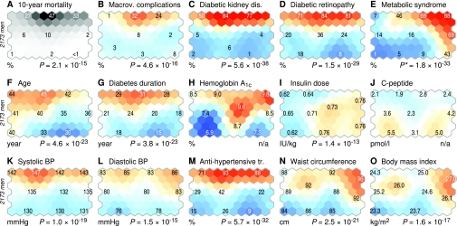
FIG. 2.
Self-organizing map colorings of clinical features for men with type 1 diabetes. The map in Fig. 1 can be colored according to the characteristics of the local residents within each hexagonal unit. The color scale indicates the deviation from population mean with respect to the random fluctuations that could be expected by chance. The numbers on selected units tell the local prevalence (binary variables) or mean value (continuous variables) for that particular region. For plot A, which illustrates time-adjusted mortality, the random fluctuations could not be estimated using the standard procedure, hence the pseudocolors are different to avoid direct comparisons with the rest of the colorings. The P values below the plots indicate the probability of observing equivalent regional variability for random data. *The metabolic syndrome included variables that were also self-organizing map inputs, hence the P value is only suggestive. Colorings for women are available in online appendix 4.

