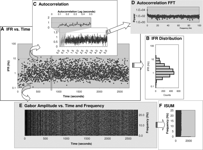
FIG. 3.
An Example of Analysis Steps. Each recording was analyzed individually with regards to both temporal and spectral structure. This figure is an example of a Type I cell. A: Instantaneous Firing Rate (IFR)—on a log-scale—is plotted vs. recording time. Note that the recording contained little data before the 1200-s mark. B: a histogram of IFR distribution (also on log scale). C: scaled (for recording length and bin-size) auto-correlogram of the spike times. Recording time is from the first to the last spike time occurrence, which in this recording excludes the period of inactivity up to the 1200-s mark. Inset shows the period before 0.5 s in greater detail. D: Fourier transform of auto-correlogram in (C). E: amplitude of the Gabor transform for each frequency and time step using a 5.0 s time window. Lighter shading reflects higher amplitudes. For the DC term the amplitude is the number of spikes occurring in that time step. Due to space limitation this plot only shows the results up to 25 Hz. The phase of the Gabor transform and the remainder of frequencies up are computed but not plotted. F: ISUM (sum of Gabor amplitudes for each frequency) from D is plotted on a log amplitude scale.

