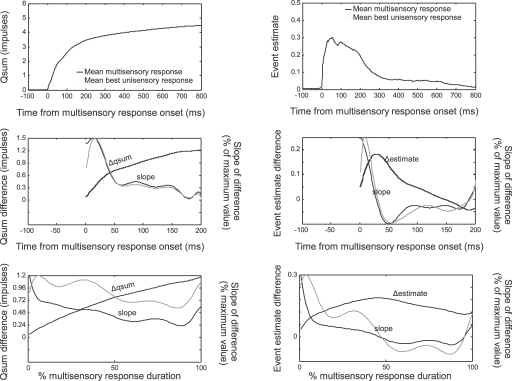
Figure 4.
The temporal profile of multisensory enhancement. Multisensory and best (i.e., largest) unisensory responses are quantified as qsums (left) or event estimates (right), shifted to synchronize with the multisensory response onset, then averaged across data samples. Average multisensory qsums and event estimates reached higher values than the corresponding best unisensory responses (top). Subtracting the multisensory and unisensory responses and averaging across samples yielded mean difference functions (middle, black lines). The mean difference functions were fit with 10th-order polynomials, illustrated with dashed black lines but virtually invisible given the closeness of the fit. The derivatives of these functions are illustrated by dotted lines and scaled proportional to their maximum value (read off right axis). Darker lines indicate the slope of the function fit after averaging across samples. Lighter lines indicate the slope fit to the individual data samples and then averaged. Slopes show a general decreasing trend. Normalizing these functions for different values of response duration (bottom) revealed the same overall trend: enhancements were high at the beginning of the response, and decreased rapidly within 40 ms or 50% of the total response duration. However, enhancement continued throughout the response.

