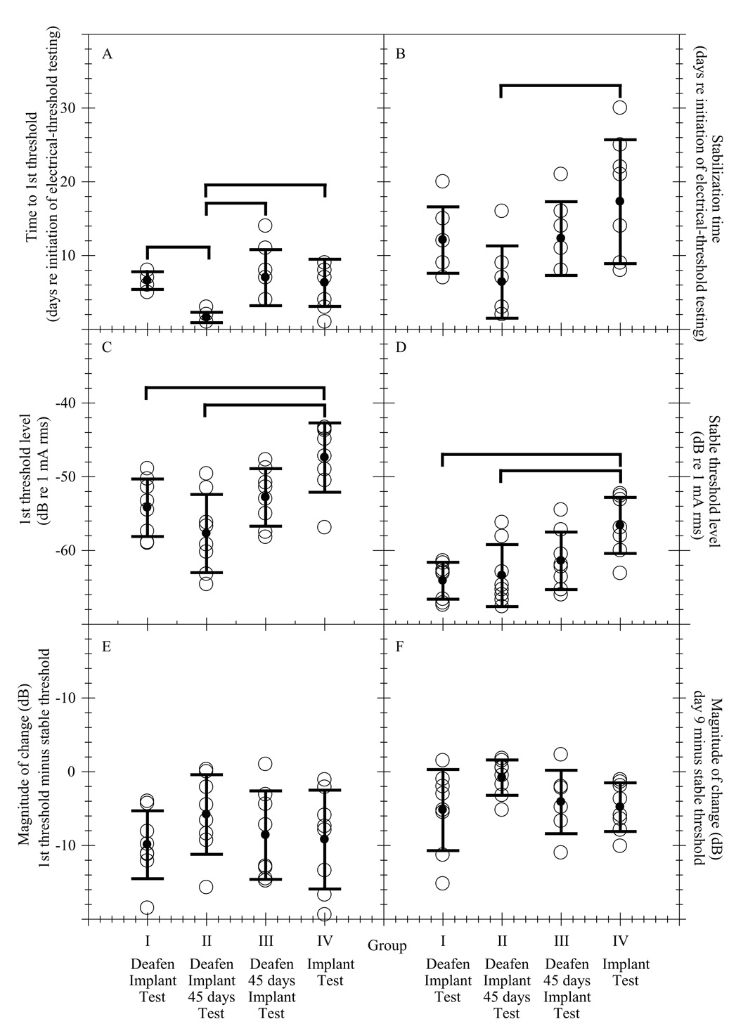
Fig. 2.
A comparison of the average group values for dependent measures 1–6. Open circles denote the average values for individual subjects. In some cases panels appear to have less than 8 open circles per group. This is because some subjects have identical data and overlap. The filled circles denote the group averages and their error bars denote ± one standard deviation. The thick solid lines above the plots indicate significant differences between groups. These data are presented numerically in Table 2.

